
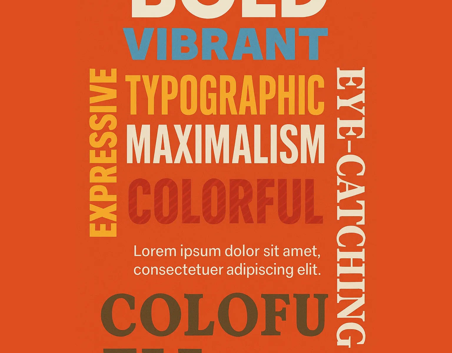
In 2025, typography is no longer just a supporting player in design — it’s the star of the show. Typographic maximalism is taking over websites, posters, and brand visuals alike, with fonts that are bold, expressive, and dominant. This trend reflects a larger cultural shift toward individuality and self-expression.
Gone are the days when typography was expected to be invisible or neutral. Now, designers are choosing daring typefaces with attitude: oversized headlines, distorted letterforms, and fonts that look hand-crafted or experimental. Every letter becomes a visual element in itself, contributing to the overall story and mood.
This typographic boldness serves a clear purpose: it captures attention instantly. In a world saturated with content, a beautifully chaotic or unconventional type treatment can stop a user mid-scroll. Brands are using typography not just to convey information, but to embody their personalities — loud, edgy, luxurious, playful, or rebellious.
Typographic maximalism is especially powerful for branding and web design. On websites, giant headlines often replace hero images entirely, creating immediate impact. In graphic design, posters and social media graphics lead with type-centered compositions, where words are the artwork.
However, not every project benefits from maximalism. Designers must still prioritize readability and hierarchy, especially for important information or functional UI components. Knowing when to go wild — and when to pull back — is key to using typographic maximalism effectively.
Looking ahead, expect more collaborations between typographers and brands, custom-made fonts for brand identity, and even variable fonts that shift dynamically depending on user interactions. In 2025, mastering type-driven design is no longer optional — it’s essential for standing out.